CDAS Concept
CDAS Concept
CDAS is built for letting people to make hospital appointments easier and faster. This case study analyses and tries to provide solutions to observed issues.
Project Overview
Role: UX/UI Design
Platform: iOS and Android
Duration: 2 Weeks
The Problem
Context
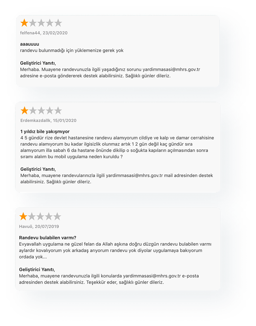
Turkey's hospital appointment system, CDAS, serves millions of users but suffers from usability issues that create frustration and barriers to healthcare access.
Pain Points
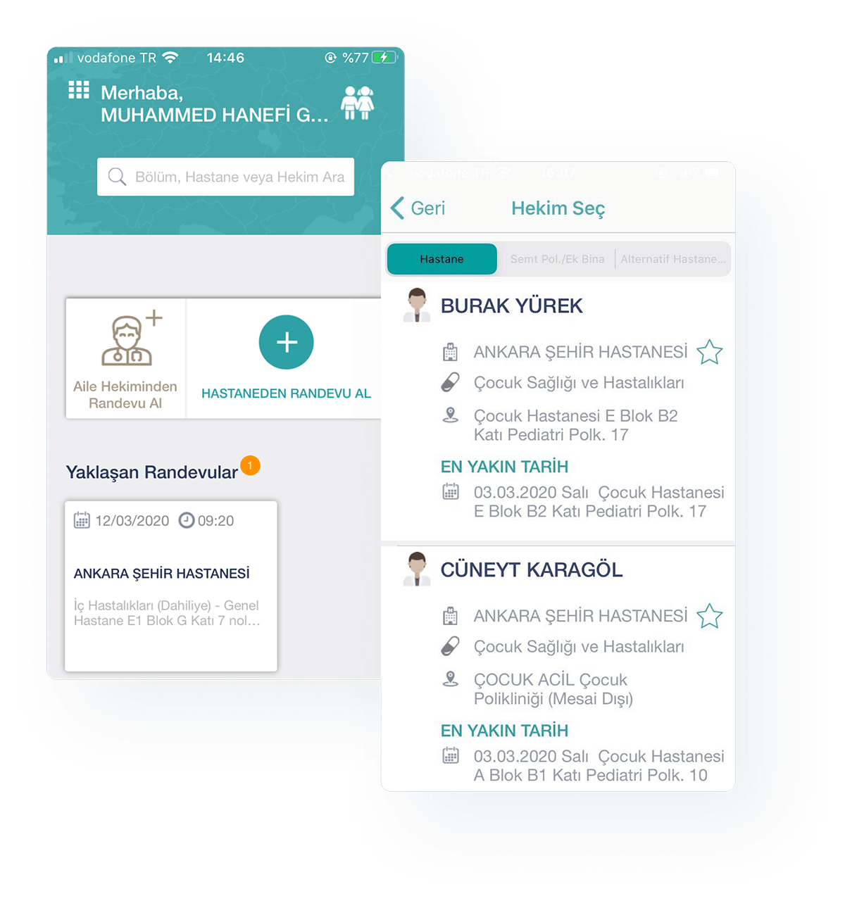
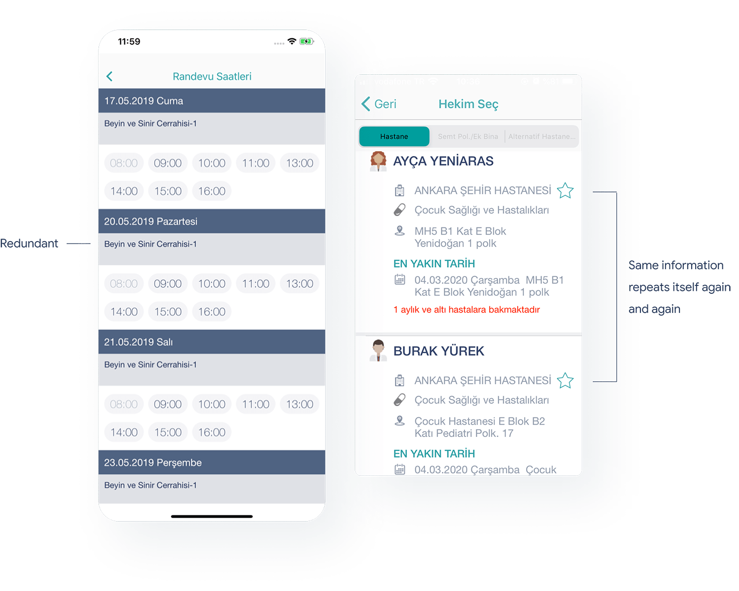
- Confusing Navigation: Users struggle to find available doctors and appointments
- Poor Error Handling: "There is no appointment at the moment" messages are discouraging
- Accessibility Issues: Low contrast ratios and unclear visual hierarchy
- Complex Workflows: Appointment booking requires too many steps
Impact
These issues result in poor user satisfaction, increased support calls, and reduced healthcare access for vulnerable populations.
The Solution
Approach
We redesigned the entire user experience with a focus on clarity, accessibility, and user empowerment.
Key Decisions
- Simplified Navigation: Reduced complexity and improved information hierarchy
- Better Error States: Helpful messaging that guides users to solutions
- Enhanced Accessibility: Improved contrast ratios and component recognition
- Streamlined Workflows: Reduced steps while maintaining functionality
Implementation
The solution was prototyped and tested with real users to ensure effectiveness.
Design Process
User Research & Problem Definition
 User Research Analysis: Understanding user pain points and behaviors
 Problem Mapping: Identifying key issues in the current system
 Accessibility Issues: Visual and interaction problems
 User Pain Points: Specific frustrations and barriers
Design Solutions
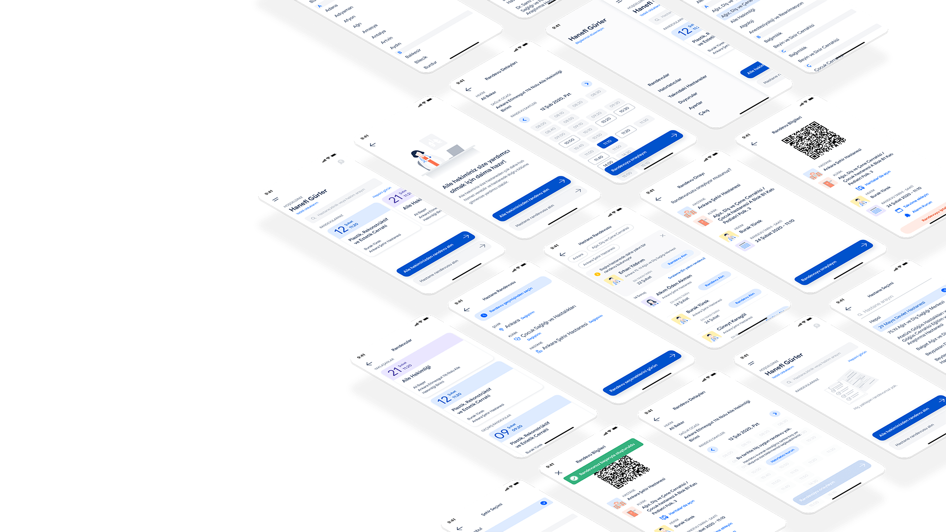
Family Doctor Appointment Flow
Doctor Appointment Process
Enhanced User Experience
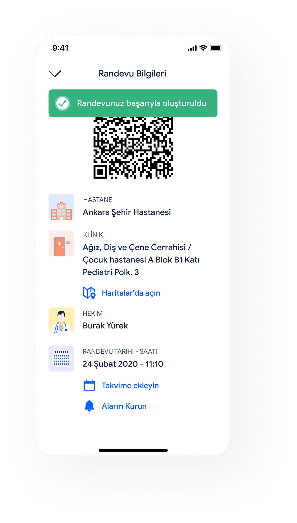 Successful Appointment: Positive completion feedback
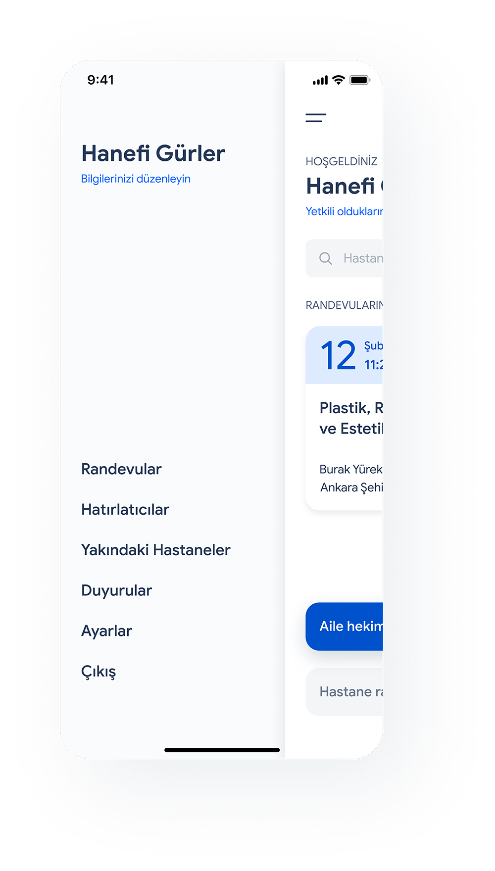 Navigation Drawer: Improved navigation structure
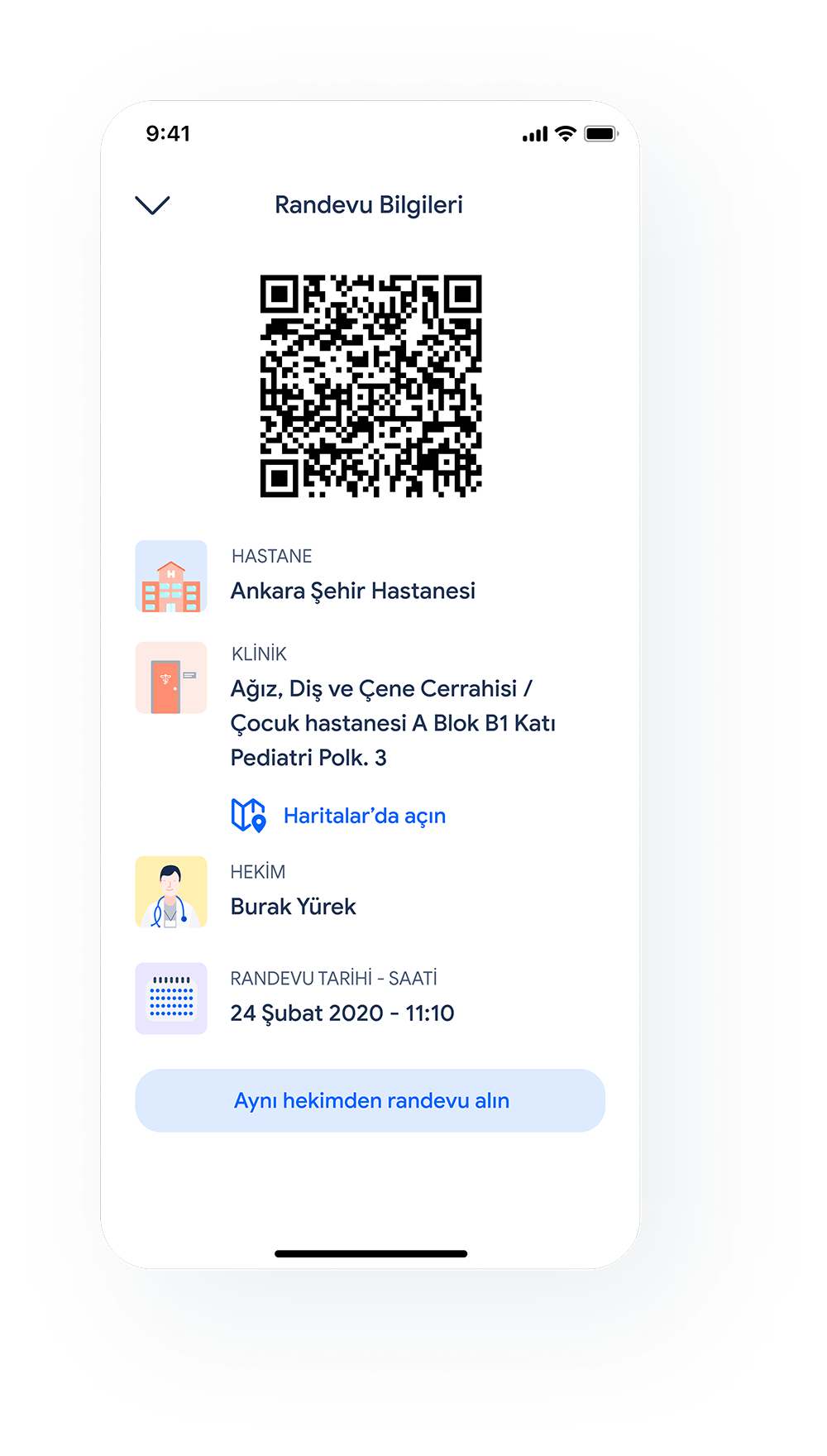 Past Appointments: Appointment history management
Accessibility Improvements
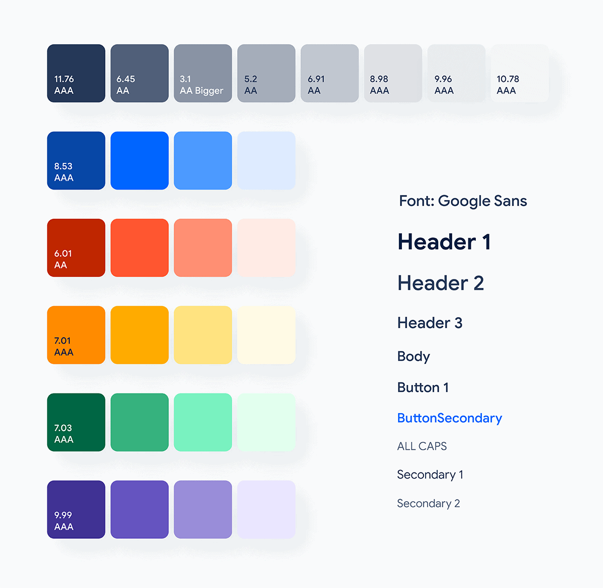 Accessibility Enhancements: Better contrast and readability
Interactive Prototypes
Homepage Experience
**Homepage Experience: Main navigation and user flow**Hospital Appointment Flow
**Hospital Appointment Flow: Complete appointment booking process**Family Doctor Appointment
**Family Doctor Appointment: Streamlined family doctor booking**Navigation Journey
**Navigation Journey: Improved menu and navigation experience**Outcome
First Change: Improved User Experience
What worked
The redesigned interface significantly improved user satisfaction and reduced appointment booking time. Users reported feeling more confident and less frustrated when using the system.
Second Change: Enhanced Accessibility
What didn't work
While accessibility improvements were implemented, some users with specific needs still found certain interactions challenging. This highlighted the need for more comprehensive accessibility testing.
Key Learnings
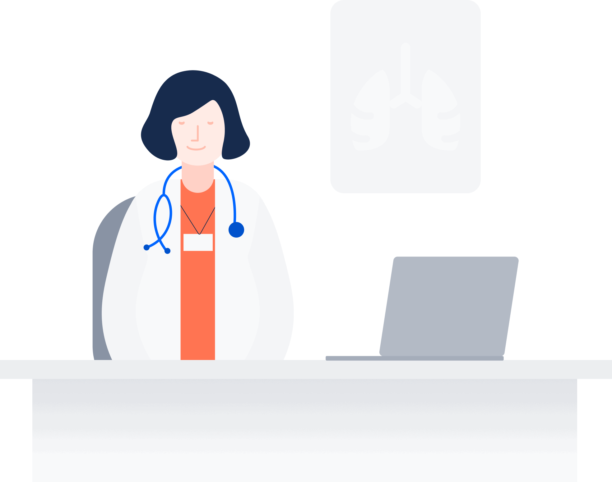 Doctor Illustration: Representing the healthcare context
Design Principles
- Clear Communication: Crucial in healthcare applications where clarity saves time and reduces stress
- Helpful Error States: Error messages should guide users to solutions, not discourage them
- Accessibility First: Design for all users from the beginning, not as an afterthought
- User Feedback: Invaluable for understanding real pain points and validating solutions
Impact
This concept demonstrates how thoughtful UX design can transform essential public services, making them more accessible and user-friendly while maintaining the functionality required by complex healthcare systems.
CDAS is a trademark of Republic of Turkey Ministry of Health, registered in Turkey. Apple and iPhone are trademarks of Apple Inc., registered in the U.S. and other countries and regions. All rights belongs to owners.